Creating Your First Dashboard
This section is focused on documentation for end-users who will be using Superset for the data analysis and exploration workflow (data analysts, business analysts, data scientists, etc).
In addition to this site, Preset.io maintains an updated set of end-user documentation at docs.preset.io.
This tutorial targets someone who wants to create charts and dashboards in Superset. We’ll show you how to connect Superset to a new database and configure a table in that database for analysis. You’ll also explore the data you’ve exposed and add a visualization to a dashboard so that you get a feel for the end-to-end user experience.
Connecting to a new database
Superset itself doesn't have a storage layer to store your data but instead pairs with your existing SQL-speaking database or data store.
First things first, we need to add the connection credentials to your database to be able to query and visualize data from it. If you're using Superset locally via Docker compose, you can skip this step because a Postgres database, named examples, is included and pre-configured in Superset for you.
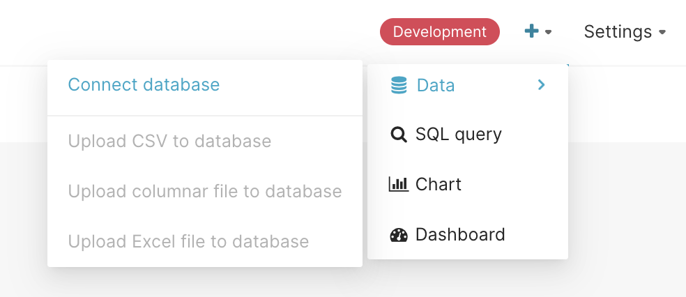
Under the + menu in the top right, select Data, and then the Connect Database option:
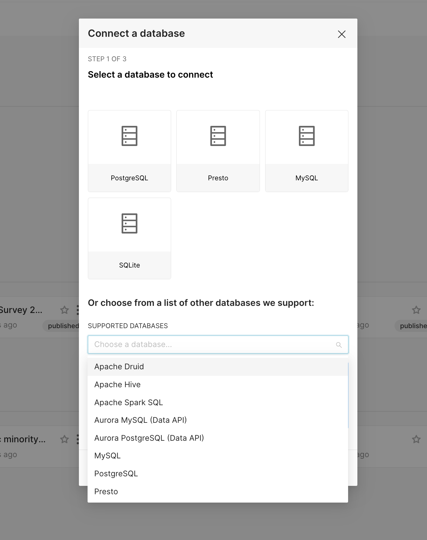
Then select your database type in the resulting modal:
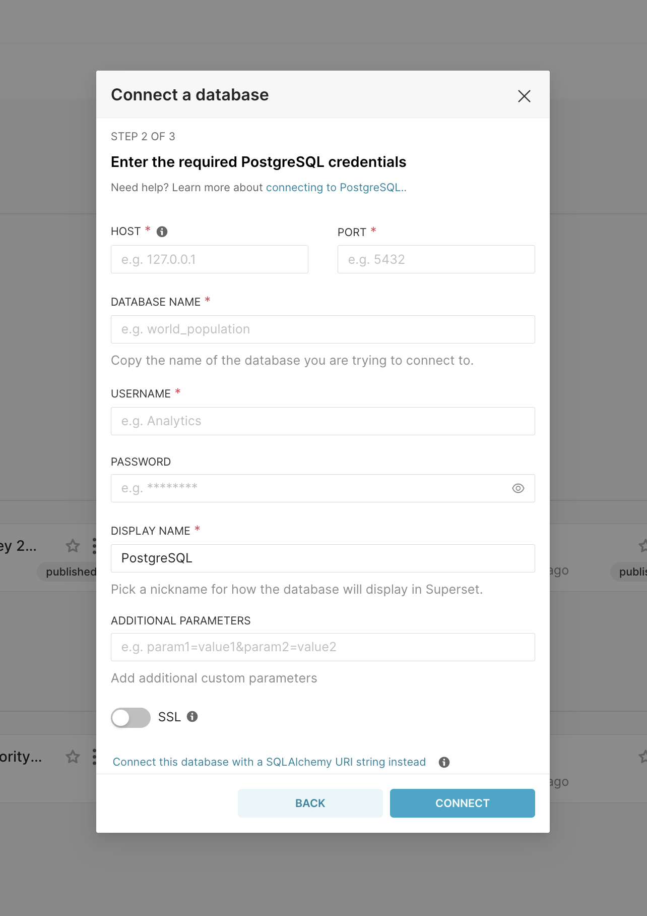
Once you've selected a database, you can configure a number of advanced options in this window, or for the purposes of this walkthrough, you can click the link below all these fields:
Please note, if you are trying to connect to another locally running database (whether on host or another container), and you get the message The port is closed., then you need to adjust the HOST to host.docker.internal
Once you've clicked that link you only need to specify two things (the database name and SQLAlchemy URI):
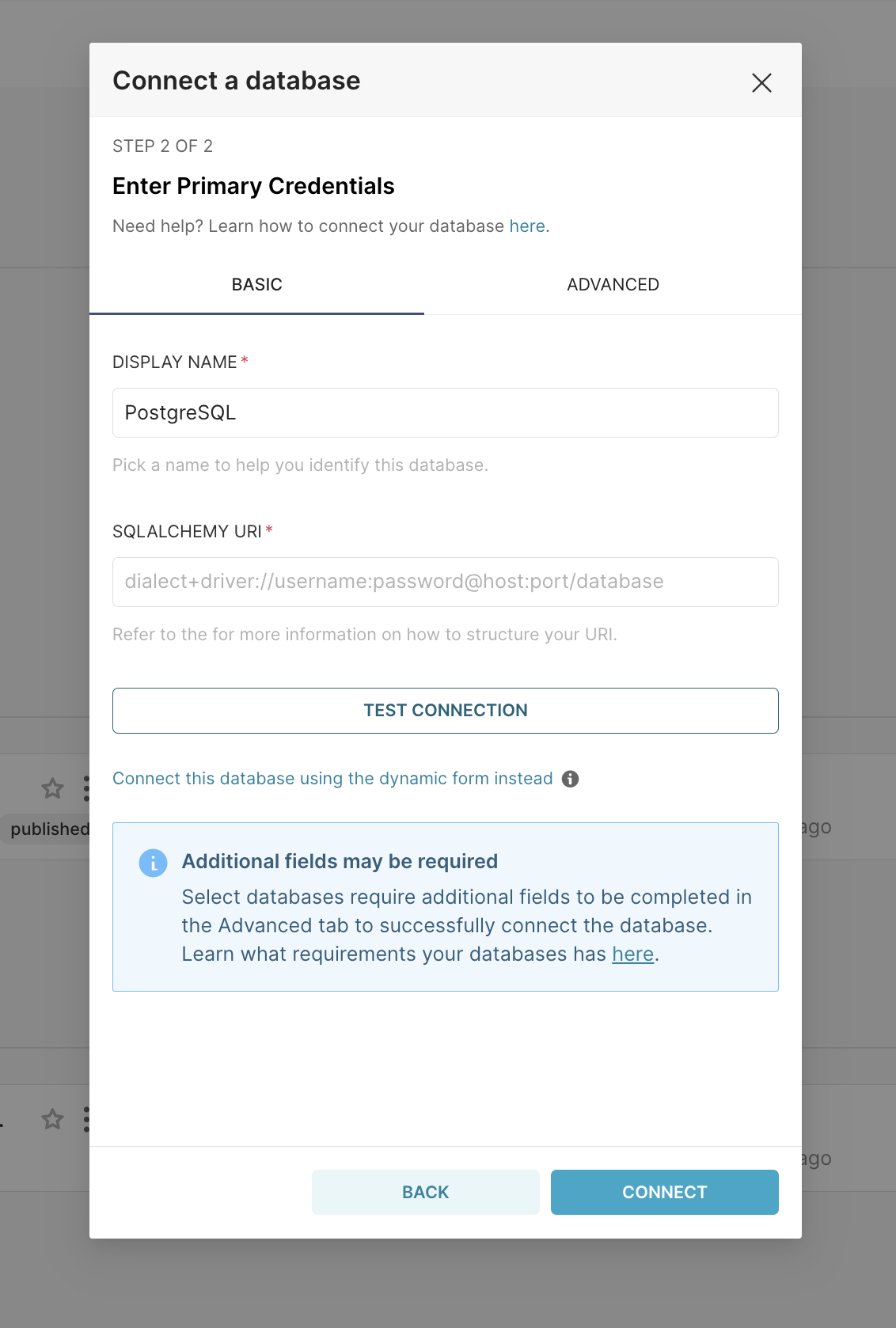
As noted in the text below the form, you should refer to the SQLAlchemy documentation on creating new connection URIs for your target database.
Click the Test Connection button to confirm things work end to end. If the connection looks good, save the configuration by clicking the Connect button in the bottom right corner of the modal window:
Congratulations, you've just added a new data source in Superset!
Sharing a Database Connection
When adding a new database, you can share the connection with other Superset users. Shared connections appear in other users' database lists, making it easier to collaborate on the same data without requiring each user to configure the same connection separately.
To share a connection, enable the Share connection with other users option in the Advanced tab of the database connection modal before saving. You can change sharing settings later by editing the database connection.
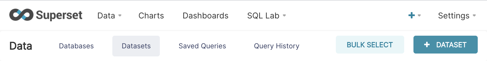
Registering a new table
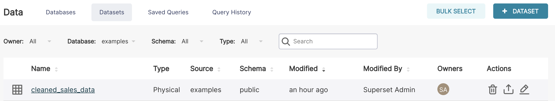
Now that you’ve configured a data source, you can select specific tables (called Datasets in Superset) that you want exposed in Superset for querying.
Navigate to Data ‣ Datasets and select the + Dataset button in the top right corner.
A modal window should pop up in front of you. Select your Database, Schema, and Table using the drop downs that appear. In the following example, we register the cleaned_sales_data table from the examples database.
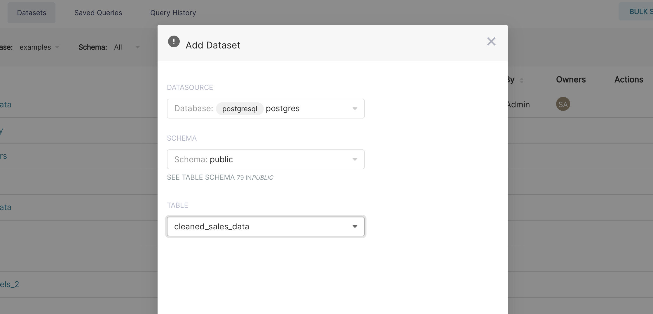
To finish, click the Add button in the bottom right corner. You should now see your dataset in the list of datasets.
Organizing Datasets into Folders
The Datasets list view supports folders for organizing datasets into groups. To create and manage folders:
- In the Datasets list, click the Folders panel on the left sidebar.
- Click + New Folder to create a top-level folder, or drag an existing folder to nest it.
- Drag dataset rows onto a folder to move them in, or right-click a dataset and select Move to folder.
Folders are per-user organizational aids — they do not affect dataset access permissions or how other users see the datasets.
Uploading Files via the OS File Manager (PWA)
When Superset is installed as a Progressive Web App (PWA) from your browser, your operating system will offer Superset as an option when opening CSV, Excel (.xls/.xlsx), and Parquet files. Double-clicking or right-clicking a supported file and selecting "Open with Superset" navigates directly to the upload workflow for that file.
To install Superset as a PWA, look for the install icon in your browser's address bar (Chrome, Edge) when visiting your Superset instance over HTTPS. PWA installation requires HTTPS and a valid manifest — your admin needs to confirm the app manifest is served correctly.
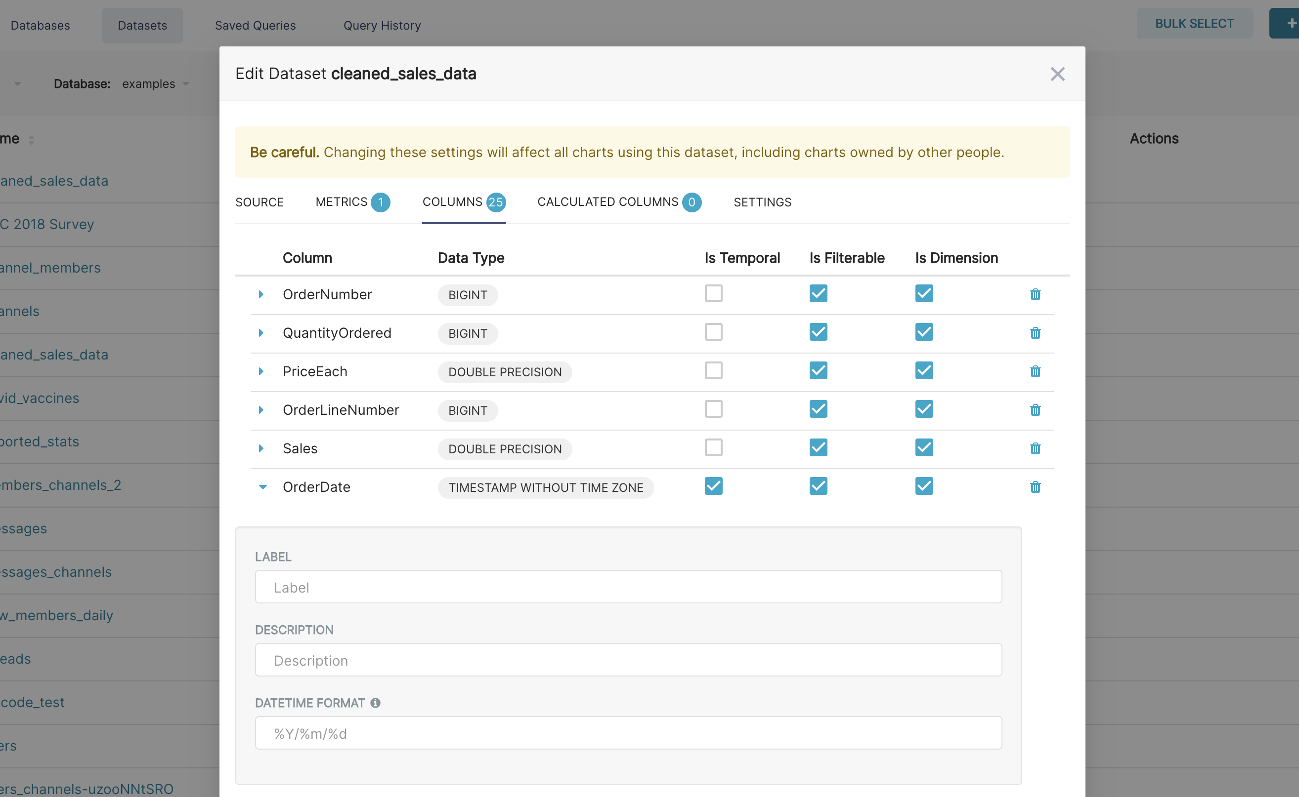
Customizing column properties
Now that you've registered your dataset, you can configure column properties for how the column should be treated in the Explore workflow:
- Is the column temporal? (should it be used for slicing & dicing in time series charts?)
- Should the column be filterable?
- Is the column dimensional?
- If it's a datetime column, how should Superset parse the datetime format? (using the ISO-8601 string pattern)
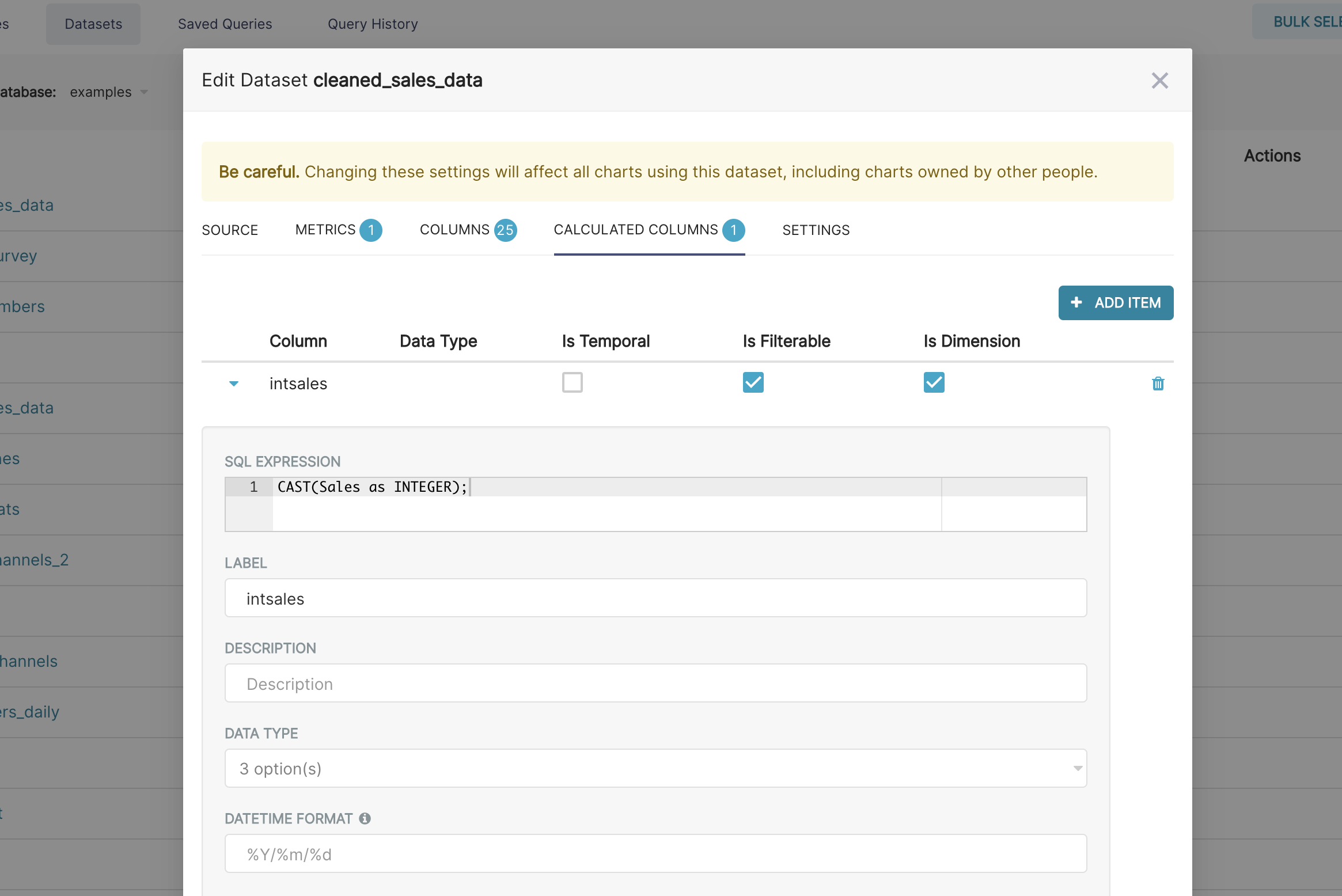
Superset semantic layer
Superset has a thin semantic layer that adds many quality of life improvements for analysts. The Superset semantic layer can store 2 types of computed data:
- Virtual metrics: you can write SQL queries that aggregate values
from multiple column (e.g.
SUM(recovered) / SUM(confirmed)) and make them available as columns for (e.g.recovery_rate) visualization in Explore. Aggregate functions are allowed and encouraged for metrics.
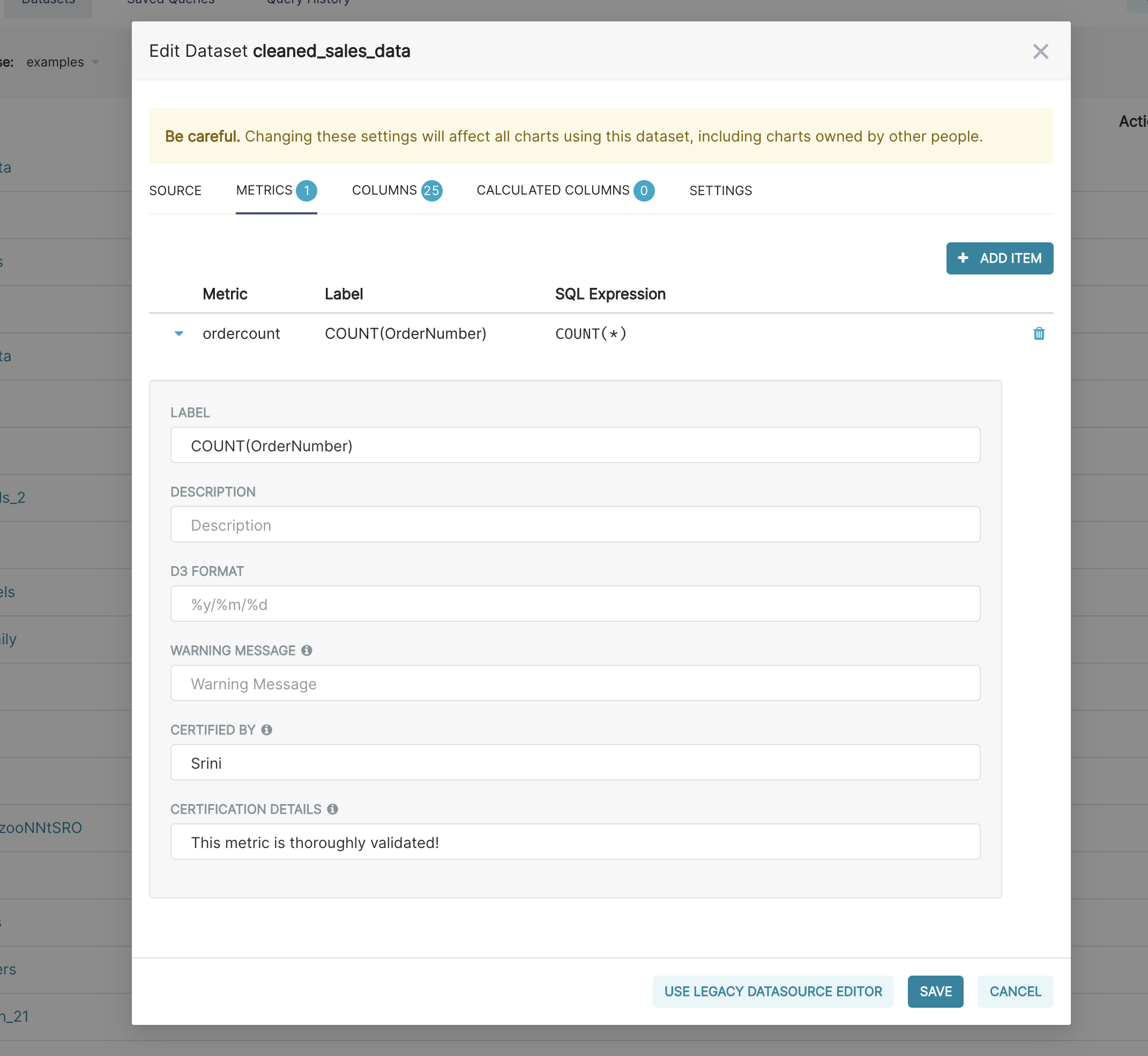
You can also certify metrics if you'd like for your team in this view.
- Virtual calculated columns: you can write SQL queries that
customize the appearance and behavior
of a specific column (e.g.
CAST(recovery_rate as float)). Aggregate functions aren't allowed in calculated columns.
Additional Resources
- Using Metrics and Calculated Columns - In-depth guide to the semantic layer
- Blog: Understanding the Superset Semantic Layer
- Blog: Unlocking the Power of Virtual Datasets
Creating charts in Explore view
Superset has 2 main interfaces for exploring data:
- Explore: no-code viz builder. Select your dataset, select the chart, customize the appearance, and publish.
- SQL Lab: SQL IDE for cleaning, joining, and preparing data for Explore workflow
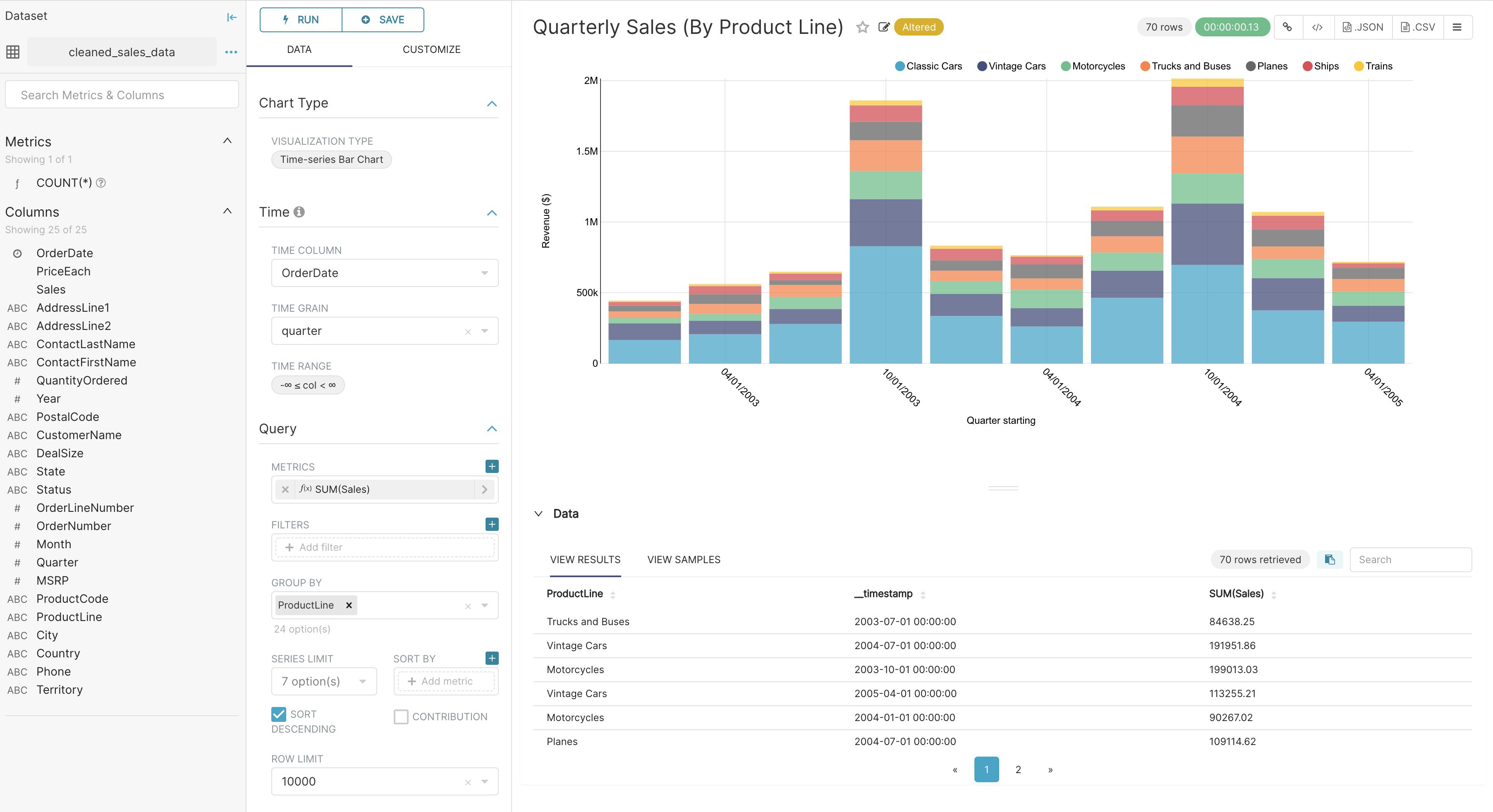
We'll focus on the Explore view for creating charts right now. To start the Explore workflow from the Datasets tab, start by clicking the name of the dataset that will be powering your chart.
You're now presented with a powerful workflow for exploring data and iterating on charts.
- The Dataset view on the left-hand side has a list of columns and metrics, scoped to the current dataset you selected.
- The Data preview below the chart area also gives you helpful data context.
- Using the Data tab and Customize tabs, you can change the visualization type, select the temporal column, select the metric to group by, and customize the aesthetics of the chart.
As you customize your chart using drop-down menus, make sure to click the Run button to get visual feedback.
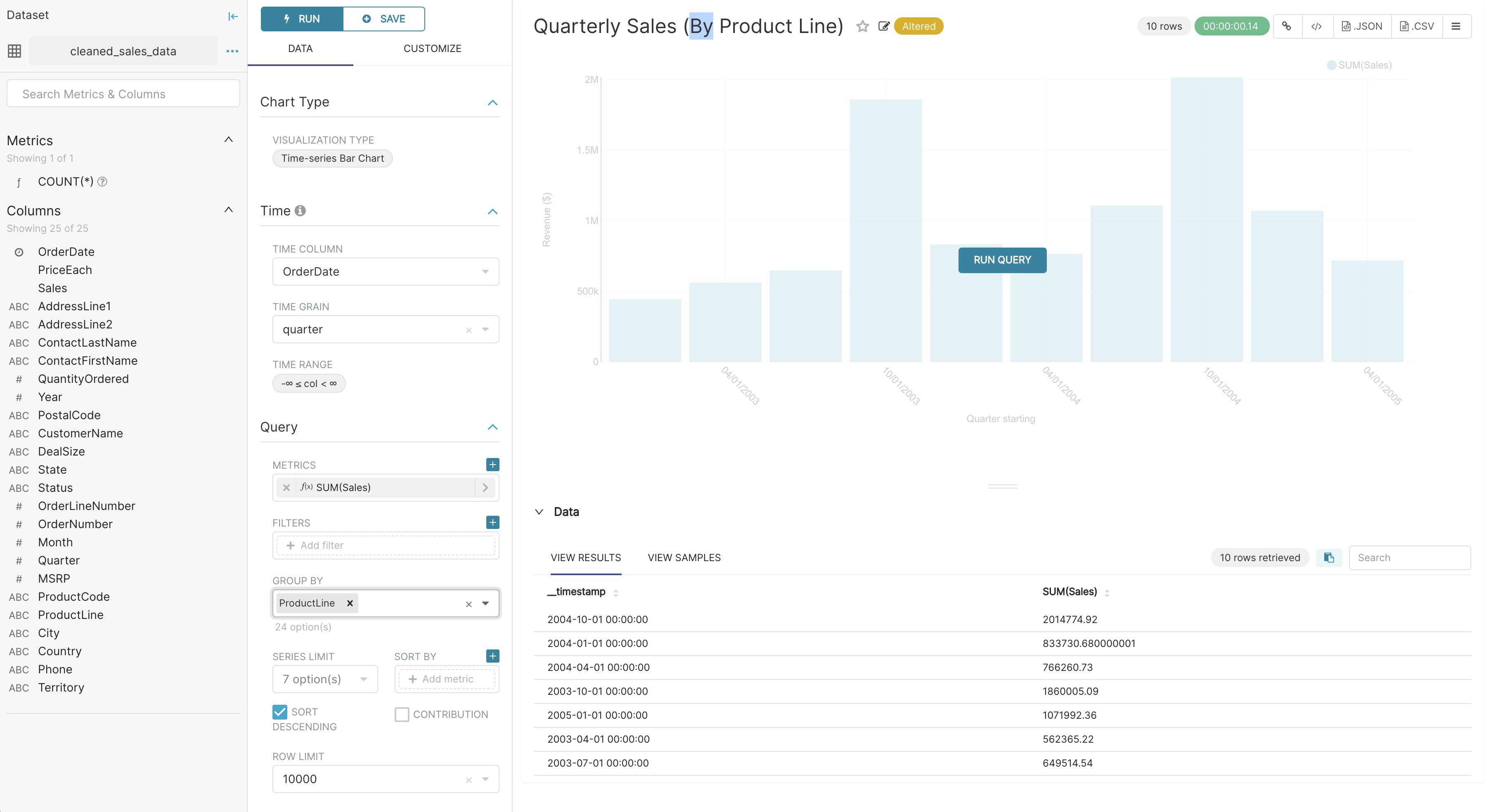
In the following screenshot, we craft a grouped Time-series Bar Chart to visualize our quarterly sales data by product line just by clicking options in drop-down menus.
Creating a slice and dashboard
To save your chart, first click the Save button. You can either:
- Save your chart and add it to an existing dashboard
- Save your chart and add it to a new dashboard
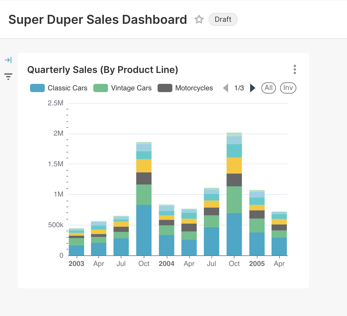
In the following screenshot, we save the chart to a new "Superset Duper Sales Dashboard":
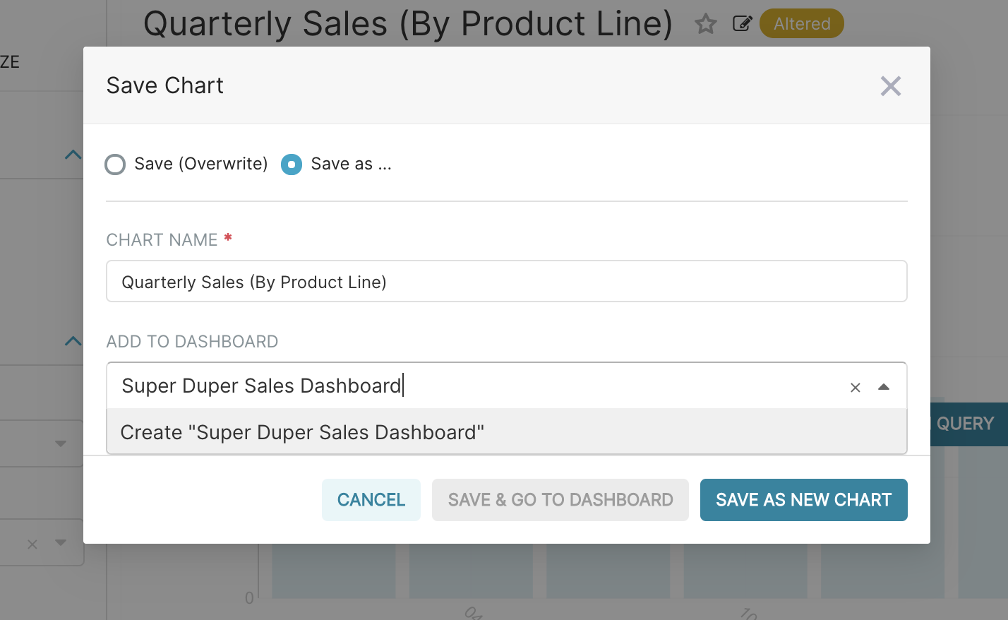
To publish, click Save and goto Dashboard.
Behind the scenes, Superset will create a slice and store all the information needed to create your chart in its thin data layer (the query, chart type, options selected, name, etc).
To resize the chart, start by clicking the Edit Dashboard button in the top right corner.

Then, click and drag the bottom right corner of the chart until the chart layout snaps into a position you like onto the underlying grid.
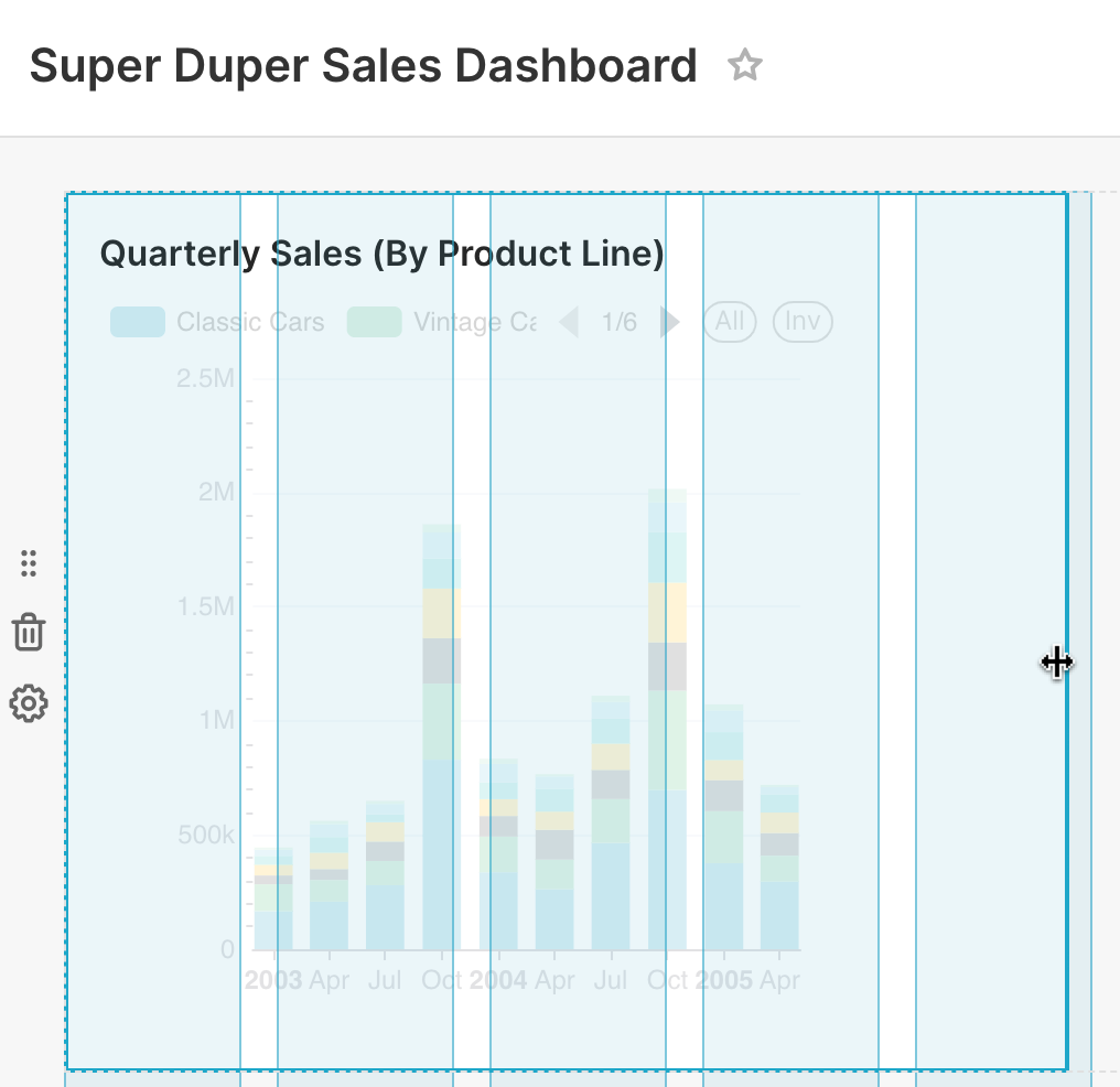
Click Save to persist the changes.
Congrats! You’ve successfully linked, analyzed, and visualized data in Superset. There are a wealth of other table configuration and visualization options, so please start exploring and creating slices and dashboards of your own.
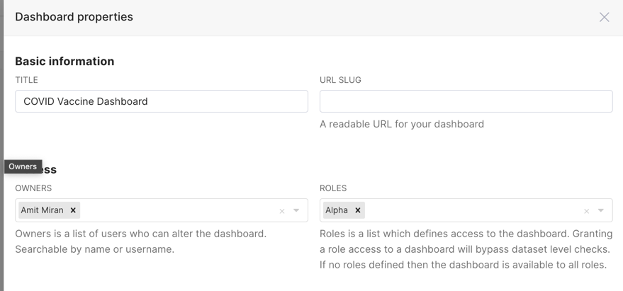
Manage access to Dashboards
Access to dashboards is managed via owners and permissions. Non-owner access can be controlled
through dataset permissions or dashboard-level roles (using the DASHBOARD_RBAC feature flag).
For detailed information on configuring dashboard access, see the Dashboard Access Control section in the Security documentation.
Publishing a Dashboard
If you would like to make your dashboard available to other users, click on the Draft button next to the
title of your dashboard.
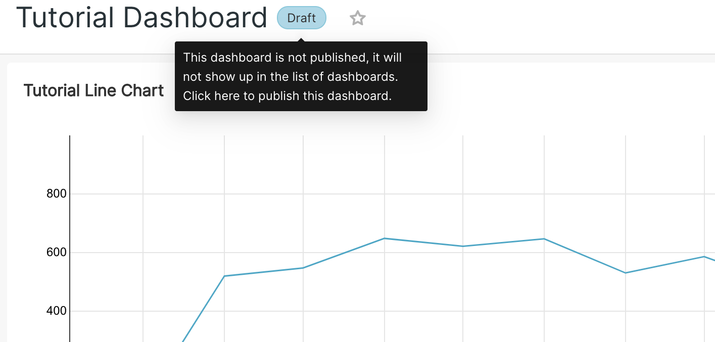
Draft dashboards are only visible to the dashboard owners and admins. Published dashboards are visible to all users with access to the underlying datasets or if RBAC is enabled, to the roles that have been granted access to the dashboard.
Mark a Dashboard as Favorite
You can mark a dashboard as a favorite by clicking on the star icon next to the title of your dashboard. This makes it easier to find it in the list of dashboards or on the home page.
Customizing dashboard
The following URL parameters can be used to modify how the dashboard is rendered:
standalone:0(default): dashboard is displayed normally1: Top Navigation is hidden2: Top Navigation + title is hidden3: Top Navigation + title + top level tabs are hidden
show_filters:0: render dashboard without Filter Bar1(default): render dashboard with Filter Bar if native filters are enabled
expand_filters:- (default): render dashboard with Filter Bar expanded if there are native filters
0: render dashboard with Filter Bar collapsed1: render dashboard with Filter Bar expanded
For example, when running the local development build, the following will disable the
Top Nav and remove the Filter Bar:
http://localhost:8088/superset/dashboard/my-dashboard/?standalone=1&show_filters=0
AG Grid Interactive Table
The AG Grid Interactive Table chart type is Superset's fully-featured data grid, suitable for large paginated datasets where the standard Table chart is not enough.
Server-Side Column Filters
AG Grid supports server-side column filters that query the full dataset — not just the loaded page. Filters are applied before data is sent to the browser, so results are correct even across millions of rows.
Available filter types:
| Column type | Filter options |
|---|---|
| Text | Contains, equals, starts with, ends with |
| Number | Equals, not equal, less than, greater than, between |
| Date | Before, after, between, blank |
| Set | Select from a list of distinct values |
AND / OR logic: Each column supports combining multiple conditions with AND or OR. Filters from different columns are always combined with AND.
Interaction with pagination: Server-side filters run as WHERE clauses in the underlying SQL query, so pagination always operates over the already-filtered result set.
Time Shift (Time Comparison)
AG Grid Interactive Table supports Time Shift (time comparison), matching the behavior of the standard Table chart. In the Advanced Analytics → Time Comparison section of the chart configuration, enter a shift expression (e.g., 1 year ago, minus 7 days) to add comparison columns showing values from the offset period. Dashboard-level time range overrides apply to both the base and comparison periods.
Dynamic Currency Formatting
Chart metric values can display currencies dynamically rather than using a fixed currency code. To enable:
- Open the dataset editor for your dataset (Datasets → Edit).
- In the Advanced tab, set Currency Code Column to the name of a column in your dataset that contains ISO 4217 currency codes (e.g.,
USD,EUR,GBP). - In the Explore chart configuration, open the metric's Number format section and select Auto-detect for currency.
When Auto-detect is active, each row uses the currency code from the designated column, so a single chart can display values in multiple currencies — each formatted correctly for its currency.
ECharts Option Editor
For ECharts-based chart types (line, bar, area, scatter, pie, and others), Explore includes an advanced ECharts Option Editor that accepts raw JSON overrides for the underlying ECharts configuration.
Access it via the Customize tab → ECharts Options section at the bottom of the panel. The JSON you enter is deep-merged on top of Superset's generated ECharts config, so you can override specific options without rewriting the entire config.
Example: override the legend position and add a custom title:
{
  "legend": { "orient": "vertical", "right": "5%", "top": "middle" },
  "title": { "text": "My Custom Title", "left": "center" }
}
ECharts option overrides bypass Superset's validation layer. Invalid option keys are silently ignored by ECharts. Overrides that conflict with Superset-generated options (e.g., series) may produce unexpected results.
Table Chart: Exporting Filtered Data
When the Search Box is visible in a Table chart, the Download action exports only the rows currently visible after the search filter is applied — not the full underlying dataset. This matches the visual output and is intentional. To export the full dataset regardless of search state, use the Download as CSV option from the chart's three-dot menu in the dashboard or from the Explore chart toolbar before applying a search filter.
Additional Resources
- Dashboard Customization - Advanced dashboard styling and layout options
- Blog: BI Dashboard Best Practices